Fashion conscious lighthouses


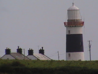
Two views of Hook Head - white with two black stripes (post 1933) and white with three red stripes (1859 - 1933) The change caused a riot on the catwalk
In a recent post, I focussed on the confusion that could occur by careless naming of our coastal light stations - St. John's Point could get mixed up with St. John's Point, for example, or Blackrock with Blackrock. Hard to see how, but apparently it happened.
Quite coincidentally, Andrew Doherty in his always-compelling Tides and Tales blog, recently described the sinking of the sailing ship Columbus off Hook Head in 1852. The reasons for the tragedy were many and varied but one of them sparked my attention.
At 5 p.m. I made the Hook lighthouse and, from being unable to see the land, it had the appearance of Tusker. At half-past 5 saw the light and found that we were embayed.
Not being a seafaring chap, by any stretch of the imagination, I wondered how often it happened that you could see a lighthouse in daylight hours but not the land surrounding it. I would have thought the reverse were more common - you might see the land but not the lighthouse due to sea-mist.
But happen it must, as in the case above. Back in 1852, Hook was painted white and, if there were the slightest chance of confusion over the colour of a lighthouse, then why not paint it a different colour to its near neighbour? The Ballast Board learned their lesson and gave the Hook three red stripes, albeit seven years later.


The Old Head of Kinsale changed in 1930 from white with two red bands to black with two white bands


Blackrock Sligo was originally plain white until it started modelling a very fetching black band to the delight of lighthouse fashionistas.


Possibly the Greatest Change of Colour award goes to St. John's Point in county Down. Originally plain white, it obtained three black bands in 1902. Then in 1954, the white was changed to yellow. Maybe Brendan Behan did such a poor job of painting it in 1950 that the change was necessary. It is the only Irish lighthouse that incorporates yellow into its colour scheme and very pretty it looks too.


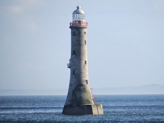
Both Mew Island light (above) and Tory Island light were originally painted black before acquiring a white band in the mid fifties. I know that Ballycottonites (and presumably Slyne Heads) are very proud of their little black number but its as if a stereotypical man had flipped through the Dulux colour charts. No 'Autumn Embers' or 'Sea Mist' here. (Actually, scrub that last one)


Mine Head in Waterford looks to have had a somewhat checkered career in the fashion world, though check never caught on with Irish lighthouses. Unfortunately I have no dates for MH's colour changes but it appears to be white in CIL's 1905 picture, then some darker hue in the 1930s (red? or dirt?) before donning its now familiar white-with-a-black-band.


Eeragh aka North Aran aka Rock Island was another that changed from red bands to black in the 1930s, so it was obviously 'a thing' rather than some Principal Keeper requesting the change so that it would go with his hair.

Not much of a change for Haulbowline at the entrance to Carlingford Lough in 1954. Its original white colour was scraped off, probably not with sheets of sandpaper, to bring it back to its natural stone colour. I quite like both versions.


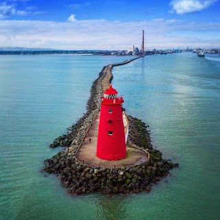
And finally, to one of our most iconic lighthouses. It's difficult to think of Poolbeg as any other colour than red but it started out life in 1820 as white. There then came a very worthy attempt to standardise harbour lights around the world, so visiting captains would know on which side of the lights they should steer. For boats entering a harbour, you kept the black lights on your port side and the red ones to starboard. So the Poolbeg got painted black. In the 20th century, this was changed to red for port and green for starboard, hence its current distinctive deep red colour.
(PS I arranged this post with the photographs side by side but for some reason, when I posted it, the photographs moved!)


Just to confuse things, the whole world didn’t change. I learned to sail in Canada using Red Right Returning as the mnemonic for how to return to harbour. I was puzzled to see the opposite in use here. There’s a good discussion of the red/green systems in use here: https://www.latitude38.com/lectronic/reconsidering-red-right-returning/
ReplyDeleteThat's a great link, Finola. Also very interesting about the flat top / round or pointy top theory. Will keep an eye out to see if that is observed here!
DeletePete, you sure mix up the blog themes on a post by post basis...Love it :)
ReplyDeleteA
ps this has helped me considerably with my own next blog
...which is eagerly awaited, Andrew!
Delete